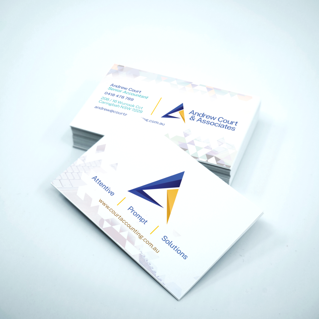
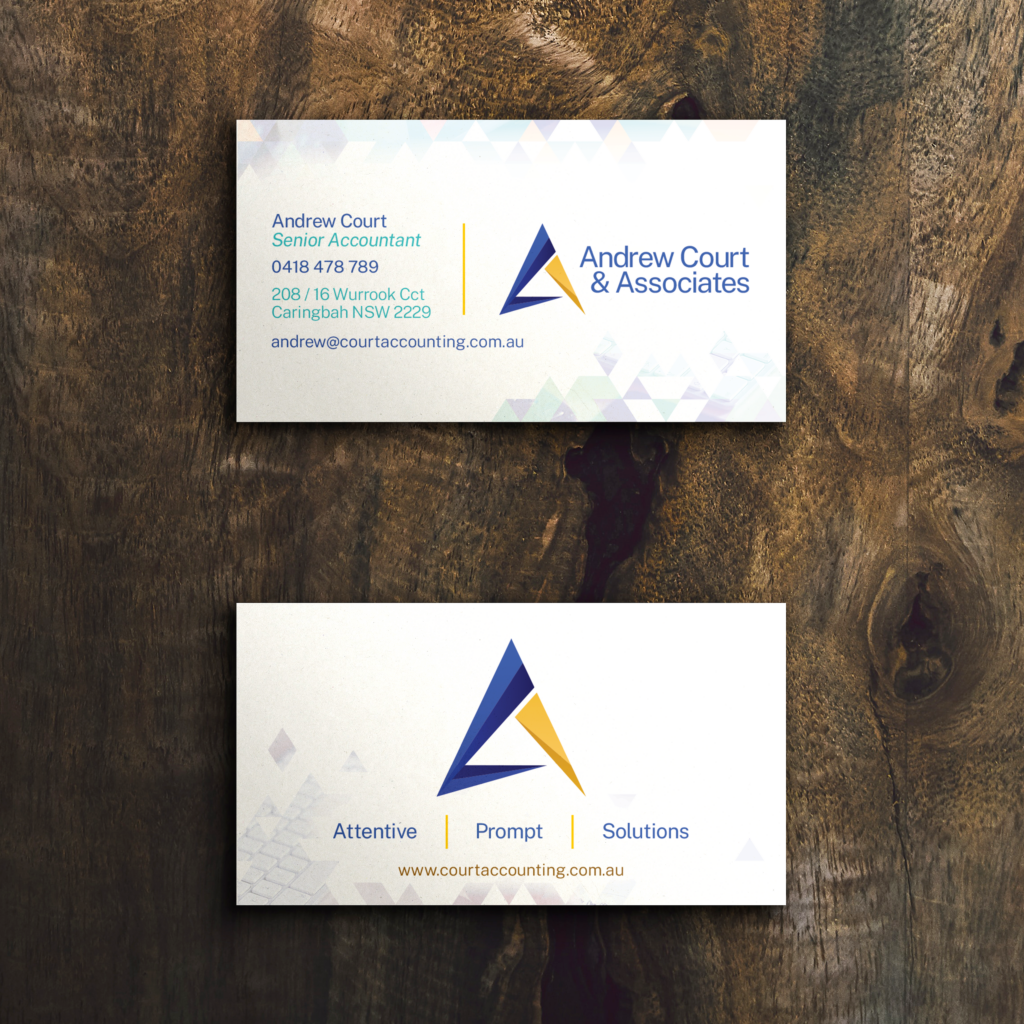
Andrew Court & Associates describe themselves as “Your friendly, family accountants, consultants and advisers.” They provide various services, including managing superannuation, bookkeeping, payroll, and other corporate and business services, and were on the lookout for a fresh and innovative visual identity for their business. Their primary objective was to revamp their logo while retaining their pre-existing colour scheme, with a design that could be easily modified and customized to suit their diverse branding requirements.
To start the project, the team created several sketches of different concepts to explore the client’s desired direction and identify how we could accommodate the level of change they were looking for. In our initial designs, we incorporated features that resembled the original logo. However, as we progressed, we became more daring. We experimented with the main triangular form present in the original design by filling strokes, building sharp and prominent forms and focal draws to evoke a bold, powerful brandmark that reflects the client’s visual identity.
To elevate the client’s visual brand, we skillfully integrated negative space, gradients, and colour to produce a multi-dimensional effect within the striking triangular shape. By introducing this dynamic interplay of vibrancy, clarity, and distinctiveness, we could preserve key elements of the original logo while infusing it with new life and energy.


