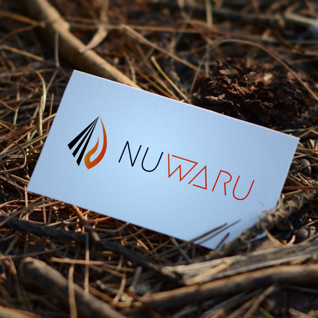
Nuwaru is a leading specialist tax and CFO advisory firm. Their brand and imagery deliberately invoke a sharp, smooth design that echoes the meaning behind their name: “New Fire”. Our original logo used soft curvatures for its text and paid its focal dues to the iconic flame as its icon, intending to create a lasting visual impression for the unique symbol itself.
Over the years, we’ve created document templates, business cards, banners, and more, fostering a warm partnership that began with a simple logo and iconic brandmark. When the time came for their new website, we gathered our ideas and set upon the great task of creating an unconventional, visual-interactive experience that was as unique and iconic as the clients themselves, with an approach founded upon the mantra “Show, Don’t Tell”.
With our course set, we found the old logo we had designed needed a facelift to fit the expressionistic visual language emerging from this website. So, amid our journey, we took it upon ourselves to transform the logo into something more befitting the new graphic identity.
In line with “Show, Don’t Tell”, the curves and thick-black ligatures comprising the Nuwaru logo’s script would give way to elegant linework that deconstructs standard lettering using a combination of semi-abstract lines and focal draws. The result is a clean, sharp logo that breaks the client’s industry conventions and commands your attention, creating a long-lasting impression for Nuwaru and their clients and – combined with their unique website – a unified visual identity that breaks norms.


